
Creating clean, visually inspiring journal spreads or study notes can feel incredibly frustrating when your ink skips, bleeds through the page, or smudges before it can dry. Finding the best Signo pen for your aesthetic note-taking and journaling depends on matching your writing speed and paper type with the correct tip size—ranging from ultra-fine 0.28 mm nibs for dense layouts to broader 1.0 mm metallic tips for headers—and selecting a body design that supports your grip during long writing sessions. By understanding how different models, tip sizes, and ink formulations interact with your paper, you can build a reliable writing toolkit that elevates your creative layouts while maintaining pristine, legible pages.
The uni-ball Signo line, manufactured by the Mitsubishi Pencil Company, has earned a dedicated following among stationery enthusiasts for its archival-quality, pigment-based gel ink. Unlike dye-based inks that can feather on porous paper or fade over time, Signo’s acid-free formula is designed to resist water and light. However, because gel ink is inherently wetter and more viscous than traditional ballpoint ink, achieving a clean aesthetic requires a deliberate choice of pen specifications.
Which Signo tip sizes and ink finishes match your note-taking style?
Matching your Signo tip size and ink finish to your writing style requires balancing the physical space on your page with the visual weight you want your words to carry. Ultra-fine tips (0.28 mm to 0.38 mm) excel at dense, structured layouts, while broader tips (0.7 mm to 1.0 mm) are ideal for bold headers, decorative borders, and high-contrast accents. Selecting the wrong combination can lead to cramped, illegible text or excessive smudging, making it essential to align your pen’s technical specs with your creative goals.
Products mentioned in this guide
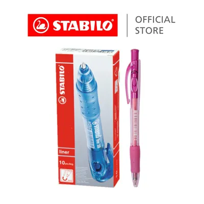
1,133 Lazada user ratings
Smooth ink flow for effortless writing., The click mechanism ensures no mess., Quality:Excellent writing quality, Design:Ergonomic design, P…Read full reviewShow less
Smooth ink flow for effortless writing., The click mechanism ensures no mess., Quality:Excellent writing quality, Design:Ergonomic design, Price:Fair pricing, highly recommended to buy
The click mechanism is easy to use., The rubber grip provides a comfortable hold., The black ink is bold and professional.,
Prompt delivery. Bought cheaper via Lazada as compared to retail $3.20/pack. Six different colors. Smooth writing. Thanks.
The rubber grip provides a comfortable hold., Smooth ink flow for effortless writing., Price:value for money
This is my favorite pens to use. I ordered it every time if shorts of pens
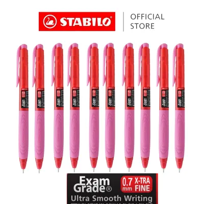
601 Lazada user ratings
Fast delivery. Have been using Stabilo 388 blue pen and love it, kid would like to try its black pen. I believe the black ones are as good.
I like this brand. Bought a bunch of different stationery. They all look good. The quality is very good too.
Suitable for both students and professionals, Smooth ink flow for effortless writing, Great quality.
good pen for primary schoolers. wish it was more discounts as it finished quite fast.
Durable and long-lasting, Comfortable grip for extended writing sessions,
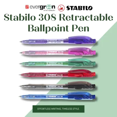
14 Lazada user ratings
Quality: smooth and good Design: easy to hold Price: cheaper than retail Ideal for school or office, Durable and reliable, Ergonomic grip fo…Read full reviewShow less
Quality: smooth and good Design: easy to hold Price: cheaper than retail Ideal for school or office, Durable and reliable, Ergonomic grip for comfortable writing, Perfect for everyday use,
Smooth writing experience, Great value for money, Long-lasting ink,
received in gd condition. smooth to write. thank you seller.
received I'm Good condition thanks seller................
Ideal for school or office,
Prices are valid at publication and may change. Please refer to the product page for the latest price.
Selecting the Ideal Tip Size for Your Layouts
For writers who favor compact notebooks, grid-lined journals, or highly detailed study notes, ultra-fine tips like the 0.28 mm and 0.38 mm are exceptionally well-suited. These sizes allow you to write tiny, precise characters within 3 mm or 5 mm grids without the ink pooling or closing up loops in letters like “e” or “a.” However, because these tips are incredibly thin, they can feel slightly scratchy on textured paper and require a lighter hand to prevent tearing the page fibers.
If your journaling style involves rapid, cursive writing or expansive daily reflections, a medium tip size such as 0.5 mm or 0.7 mm offers a smoother, more fluid writing experience. The larger tungsten carbide ball rolls with less resistance, delivering a consistent flow of ink that keeps pace with quick hand movements. While these sizes produce a bolder, more legible line from a distance, they also deposit more ink onto the page, which increases the drying time and requires slightly larger handwriting to maintain clarity.
Understanding Gel, Pastel, and Metallic Ink Finishes
The visual impact of your notes is heavily influenced by the specific ink formulation you choose. Standard Signo gel ink is highly pigmented and dries to a flat, vibrant finish that is completely waterproof once fully cured. This makes it the ideal choice for foundational text, daily logs, and any writing that might later be highlighted with water-based mild liners or brush pens.
For decorative accents, the pastel (often labeled as Angel Color) and metallic finishes offer unique creative possibilities. Pastel inks are formulated with a high concentration of titanium dioxide, resulting in a thick, chalky, and highly opaque line that stands out beautifully on dark, kraft, or colored paper. Metallic inks contain tiny reflective particles suspended in the gel medium, creating a shimmering effect that adds dimension to headers, borders, and hand-lettered titles. Both pastel and metallic variations flow more generously than standard inks, meaning they require extra drying time and a patient hand.
Observable Criteria for Testing Ink Performance
Before committing to a specific tip size or finish for an entire journal setup, it is wise to perform a series of simple, observable trials on your preferred paper. First, test for line consistency by drawing a continuous, rapid spiral across the page; a high-quality tip should deliver a continuous line without skipping, railroading, or thinning out. Second, evaluate the drying speed by writing a short sentence and running a clean finger across the text at intervals of one, three, and five seconds to identify when the ink is completely smudge-safe. Finally, check the opacity of pastel or metallic inks by drawing a single stroke over a dark printed line or a black marker swatch to verify how effectively the pigment masks the underlying color.
How do the main Signo pen models differ in design and daily usability?
The primary Signo pen models differ significantly in their barrel construction, grip ergonomics, and deployment mechanisms, which directly impacts how comfortable they are for long-form writing and how easily they fit into your daily carry. Choosing between the classic capped Signo DX (UM-151) and retractable alternatives like the Signo RT1 (UMN-155) or the broad-tipped Signo Broad (UM-153) depends on whether you prioritize precision tip stability or quick, one-handed convenience. Understanding these physical differences ensures your pen matches your physical writing environment and workflow.

The Precision of Capped Models: Signo DX (UM-151)
The Signo DX, technically designated as the UM-151, is widely regarded as a reliable standard for precision gel writing. Its capped design serves a dual purpose: it protects the delicate stainless steel tip from damage during transport and ensures a completely airtight seal that prevents the water-based gel ink from drying out. Because there are no moving parts within the barrel, the tip remains absolutely rigid while writing, eliminating the tiny microscopic wobbles that can sometimes occur with retractable pens.
From an ergonomic standpoint, the DX features a relatively slim, straight barrel equipped with a ribbed rubber grip. This grip provides excellent tactile feedback and prevents your fingers from slipping down toward the nib, making it highly comfortable for detailed drawing, diagramming, or precise print handwriting. The slim profile also makes it easy to slip multiple pens into a compact pencil case, though you must be mindful of keeping track of the caps during busy study sessions.
The Convenience of Retractable Models: Signo RT and RT1
For note-taking on the go, quick brainstorming sessions, or active workplace environments, retractable models like the Signo RT1 offer unmatched convenience. With a simple click of the top plunger, the pen is ready to write, eliminating the risk of losing a cap or having to use two hands to open the pen. The RT1 model features an innovative tip design with a rounded edge that reduces friction against the paper, resulting in an incredibly smooth glide even at steep writing angles.
The body design of the RT1 is sleek and modern, featuring a seamless rubberized grip that blends smoothly into the plastic barrel without any harsh ridges or steps. This seamless transition is particularly beneficial for writers who hold their pens higher up the barrel or who suffer from finger fatigue during extended writing sessions. However, because retractable mechanisms naturally have a tiny amount of clearance between the tip and the nose cone, you may notice a very subtle clicking sound or minor tip movement during rapid writing.
Ergonomics, Barrel Thickness, and Refill Compatibility
When selecting a model, consider how the barrel thickness aligns with your hand size and grip tension. Thicker models, such as the Signo Broad (UM-153), feature a wider diameter that naturally encourages a more relaxed grip, making them excellent for individuals who tend to squeeze their pens too tightly. Conversely, slimmer models are easier to maneuver for intricate, small-scale lettering.
It is also highly practical to consider refill compatibility and environmental impact. Many Signo models, including the DX and RT1, are designed to accept standard refills (such as the UMR-1 for capped models or the UMR-85 for retractable models), allowing you to retain the comfortable outer barrel while simply swapping out the empty ink cartridge. When planning your stationery setup, remember that specific model availability, color assortments, and refill options should be verified with local stationery retailers in Singapore, as stock levels can vary between physical boutiques and online marketplaces.
What paper characteristics prevent gel ink smudging and bleeding?
To prevent gel ink from smudging, feathering, or bleeding through your pages, you must pair your Signo pens with paper that features a high basis weight (typically 80 gsm or higher), a smooth but uncoated surface texture, and sizing that controls ink absorption. Because gel ink is water-based and highly pigmented, it requires a delicate balance: the paper must absorb the liquid quickly enough to prevent smudging, yet resist absorbing so much that the ink spreads laterally or seeps through to the other side. Understanding these paper dynamics is crucial for maintaining clean, double-sided journal entries.
Evaluating Paper Weight, Coating, and Texture
The weight of your notebook paper, measured in grams per square meter (gsm), is the first line of defense against ink bleeding and ghosting. While ultra-lightweight papers (such as 52 gsm to 68 gsm) can handle gel ink if they are highly sized, they often suffer from significant “ghosting,” where the writing is clearly visible from the reverse side of the page. For a clean, double-sided aesthetic, opting for paper between 80 gsm and 120 gsm provides the physical density required to keep heavy gel ink lines from showing through.
Surface coating and texture also play a pivotal role in how the ink behaves. Highly coated, glossy papers prevent the water in the gel ink from penetrating the fibers, resulting in extremely long drying times and a high risk of smudging when you turn the page. Conversely, highly textured or toothy papers can act like a sponge, pulling too much ink from the pen tip, which causes feathering (where the ink spreads outward in tiny spiderweb patterns) and can wear down or clog fine 0.28 mm tips with loose paper fibers. Look for smooth, uncoated, wood-free paper that offers a satin-like finish.
Simple At-Home Tests for Bleed-Through and Ghosting
Before committing an expensive new notebook to your journaling routine, it is highly recommended to establish a dedicated “test page” at the very back of the book. To perform a comprehensive compatibility check, draw a small grid of test patterns using your wettest Signo pen (typically a 0.7 mm or 1.0 mm model). Include a line of normal handwriting, a solid colored block, and a heavy cross-hatch pattern where lines intersect repeatedly.
Allow the test patterns to dry completely, then inspect the page under strong, neutral light. Turn the page over to evaluate the reverse side: look closely for any pinpricks of ink that have fully penetrated the paper (bleed-through) or any dark shadows that make the reverse side unusable (ghosting). If you observe bleed-through, the paper is too porous or thin for that specific pen tip size, indicating you should step down to a finer nib or switch to a more resilient notebook.
Adjusting Writing Techniques for Broader Tips
When using broader Signo tips like the 0.7 mm or 1.0 mm metallic and pastel models, the sheer volume of ink deposited requires slight adjustments to your writing technique. To prevent the wet ink from smudging as your hand moves across the page, try writing from left to right and top to bottom, or place a clean sheet of blotting paper or cardstock directly under your writing hand to absorb any stray moisture and protect the completed sections of your layout.
Additionally, pay attention to your writing angle and speed. Holding the pen at a very steep, vertical angle can cause the metal collar surrounding the tungsten carbide ball to scrape against the paper, restricting ink flow and creating a scratchy sensation. Maintaining a relaxed 45-to-60-degree angle ensures the ball rolls smoothly and deposits a consistent, even layer of ink. If you notice pooling or slow drying times in Singapore’s naturally humid climate, slightly increasing your writing speed can help reduce the amount of ink deposited in any single spot.
How should you curate a cohesive Signo color palette for your journal?
Curating a cohesive Signo color palette involves establishing a clear visual hierarchy by selecting one dominant base color for your main text, two complementary accent colors for headings or key details, and a high-contrast highlight shade for decorative elements. This structured approach prevents your journal pages from becoming visually chaotic, ensuring that your aesthetic notes remain highly readable and organized. By limiting your active color palette, you create a signature visual style that makes your notebooks look polished and intentional.
Establishing a Visual Hierarchy with Base and Accent Colors
The foundation of any aesthetic journal page is the base color, which should be used for at least 70% to 80% of your writing, such as daily logs, long-form reflections, or lecture notes. While classic black is a reliable choice, opting for deep, muted tones like Signo’s blue-black, brown-black, or green-black can soften the overall look of your pages while maintaining excellent legibility. These off-black shades provide a sophisticated, vintage-inspired backdrop that pairs beautifully with creative layouts.
Once your base color is established, select one or two accent colors that complement its undertones. For example, if your base is a warm brown-black, accenting with a soft golden-yellow or a terracotta-orange creates a cozy, autumnal theme. If your base is a cool blue-black, pairing it with a dusty lavender or a light blue-grey offers a calm, minimalist aesthetic. Use these accent colors strictly for subheadings, bullet points, key vocabulary, or drawing attention to important deadlines.
Layering and Correcting with High-Opacity Inks
High-opacity Signo pens, particularly the white, pastel pink, and pastel blue models, are invaluable tools for adding depth, layering, and correcting mistakes in your journal. Because these inks sit on top of the paper fibers rather than soaking in, you can use a white Signo Broad (UM-153) to write clean, crisp titles directly over dark watercolor washes, black paper, or heavy marker illustrations. This layering technique adds a professional, graphic-design quality to your headers and monthly cover pages.
These opaque pens also function as an elegant alternative to messy correction tape. If you make a minor spelling error or a stray mark, allowing the base ink to dry completely and then carefully dotting over the mistake with a white or pastel Signo pen can seamlessly mask the error. Once the opaque ink has dried, you can write directly over it with a fine-tip pen, keeping your layout clean and free of distracting white-out patches.
Verifying Swatches and Managing Screen Discrepancies
When building your custom color palette, it is important to remember that digital screens often fail to accurately represent the true undertones, sheen, and opacity of gel inks. Pastel shades can appear much brighter online than they do on paper, while metallic inks require physical movement and light reflection to show off their true shimmering qualities.
To avoid disappointment, make it a habit to swatch your pens on the exact paper stock you plan to use. If possible, visit a local stationery store in Singapore to test the pens in person under neutral lighting, or seek out verified, unedited user swatches on natural paper. Creating a dedicated swatch card that you keep in the back pocket of your journal allows you to quickly reference how your colors interact, ensuring that every new page you design remains cohesive, balanced, and visually satisfying.
Community discussion
Share your experience or ask a question. Comments are reviewed before publication.