
Finding the perfect visual balance in your notebooks requires more than just neat handwriting; it relies heavily on the tones and qualities of the ink you choose. The Zebra Sarasa gel pen lineup has earned a dedicated global following among students, journalers, and planners due to its exceptionally smooth ink flow, reliable performance, and vast color spectrum. To achieve a highly aesthetic layout, your choice of shades should complement your personal style, whether you prefer a moody, vintage look, a soft and dreamy pastel theme, or a crisp, high-contrast study layout.
Selecting the right colors involves understanding how different ink formulations interact with paper and how they influence the overall visual hierarchy of your pages. Rather than sticking to standard black or bright blue, exploring the specialized sub-lines of the Sarasa family allows you to create sophisticated color palettes that make writing a more inviting and creative experience. By matching the right ink characteristics to your journaling habits, you can transform ordinary notes into beautifully curated layouts that are both functional and visually inspiring.
Understanding Zebra Sarasa Ink Families for Aesthetic Notes
The Zebra Sarasa collection is not a single uniform line of pens, but rather a diverse ecosystem of ink formulations designed for distinct artistic and functional purposes. At the core of this lineup is the standard Sarasa Clip, celebrated for its water-based pigment gel ink that flows smoothly without scratching the paper surface. Within this broader family, Zebra has developed specialized sub-series—including the Vintage, Milk, Pastel, and Neon collections—each offering unique visual properties that cater to different aesthetic preferences.
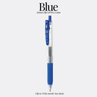
Products mentioned in this guide
13 Lazada user ratings
received in good condition. smooth to write with. comes with wax tips. came with free gift with purchase. highly recommended.
Returned buyer. Took almost a week to deliver. but this brand is good. smooth and quick dry. bought different colours.
bought different colours. good for exam use. smooth n quick dry. took almost a week to deliver..
the best pen for me
Prices are valid at publication and may change. Please refer to the product page for the latest price.
Understanding how ink opacity, saturation, and undertones behave on the page is essential for planning your layouts. Standard gel inks are typically translucent and highly saturated, delivering vibrant, crisp lines that stand out sharply on white paper. In contrast, the Milk and Pastel collections incorporate varying levels of white pigment, resulting in a milky, semi-opaque finish that sits gently on the paper surface and can even show up on darker backgrounds. The Vintage series utilizes low-saturation, complex undertones that mimic traditional fountain pen inks, offering a sophisticated, low-glare alternative for long-form writing.
These diverse series are widely accessible to stationery enthusiasts, making it easy to experiment with different combinations. You can readily find individual pens and curated multi-color sets in local stationery stores, official brand boutiques, and major online marketplaces. Because the pens are sold both individually and in packs, you have the flexibility to test single shades before committing to a complete color-coded system, allowing you to build a personalized toolkit over time.
Vintage Shades for a Classic and Muted Journal Look
For those who appreciate a nostalgic, academic, or minimalist aesthetic, the Sarasa Vintage series offers an exceptional selection of sophisticated, low-saturation tones. Unlike standard bright gel pens, the Vintage line features deep, complex colors with subtle grey or brown undertones that evoke the feel of classic fountain pen inks. Popular shades such as Vintage Blue (often labeled as Blue Gray), Dark Green (Green Black), Bordeaux (Red Black), Sepia, and Camel Yellow provide a rich, dignified look that instantly elevates the appearance of any journal entry.

One of the primary practical benefits of these muted shades is their low-glare property. Bright, highly saturated inks can sometimes cause eye strain during extended reading or writing sessions, whereas the soft, dark tones of the Vintage series are incredibly gentle on the eyes. This makes them ideal for long-form journaling, reflective diary entries, and extensive study notes where readability is just as important as visual appeal. The deep tones ensure that your writing remains highly legible from a distance, while the unique color profiles add a touch of personal character that standard black or blue ink simply cannot replicate.
To maximize the retro charm of the Vintage series, consider pairing these pens with specific paper types and decorative elements. They look exceptionally beautiful on cream-colored or off-white paper, which complements the warm undertones of shades like Sepia and Camel Yellow. You can also pair them with brown kraft paper inserts, vintage-style stickers, and muted, earthy washi tapes to create a cohesive, antique-inspired scrapbook layout. Using a deep Bordeaux or Dark Green for your main body text, combined with Camel Yellow for subtle accents, creates a balanced, academic aesthetic reminiscent of old-world libraries and classic literature.
Milk and Pastel Inks for Soft and Dreamy Pages
If your journaling style leans toward a soft, whimsical, or “dreamy” aesthetic, the Sarasa Milk and Pastel collections provide the perfect palette of gentle, low-contrast colors. The Milk series is particularly unique because of its high opacity, achieved by blending white pigment into pastel gel ink. This formulation allows the ink to sit visibly on top of the paper fibers rather than soaking deeply into them, creating a smooth, creamy line that remains distinct even on non-traditional paper surfaces.
The primary difference between the Milk and Pastel lines lies in how they interact with different paper colors. The highly opaque Milk shades—such as Milk Pink, Milk Blue, Milk Green, and Milk White—are excellent for writing on dark, black, or kraft paper, where they pop with a soft, chalk-like clarity. On the other hand, the standard Pastel collection offers a slightly more translucent, delicate wash of color that is optimized for light-colored or white paper. Both series are perfect for creating gentle visual hierarchies, allowing you to add decorative borders, soft illustrations, and subtle highlights without the harshness of traditional neon markers.
While these soft inks are incredibly charming, they do come with certain practical limitations that you should keep in mind during your planning. Very light shades, such as Milk White, Milk Yellow, or pale pastel lavender, can be difficult to read when used for fine, long-form body text on standard white paper. To maintain legibility, it is best to reserve these ultra-light colors for decorative accents, hand-lettered headers, bullet journal trackers, or gentle underlining. For the main body of your text, you can pair them with a slightly darker, contrasting pastel shade or a soft grey gel pen to ensure your thoughts remain easy to read while preserving the overall delicate theme.
Standard and Neon Inks for High-Contrast Study Notes
For students and professionals who require highly functional, organized, and structured layouts, the standard Sarasa Gel and Neon lines offer the vibrant clarity needed for effective color-coding. A well-designed study notebook relies on a clear visual hierarchy to help the brain quickly categorize and retrieve information. By utilizing bright, high-contrast colors, you can separate core concepts, key definitions, and urgent tasks, making your review sessions significantly more efficient.
The Neon series is particularly valuable for detailed annotations and precise highlighting. Traditional broad-tip highlighters can sometimes be too clumsy for small textbook margins or tight grid paper, often bleeding over into adjacent lines of text. A fine-tip Sarasa Neon pen allows you to underline key phrases, draw precise arrows, or write marginal notes in glowing shades of neon pink, yellow, or green with absolute precision. This approach keeps your pages looking neat and tidy, avoiding the messy, oversaturated look that can occur when large blocks of text are covered in heavy highlighter ink.
To maintain a clean and professional aesthetic when using highly vibrant colors, it is crucial to establish a sense of balance on the page. Flooding a notebook sheet with multiple neon and bright primary colors can quickly become visually overwhelming and chaotic. A highly effective strategy is to use a neutral, low-saturation base color—such as a dark grey, deep navy, or standard black—for 80% of your writing. You can then reserve your vibrant standard or neon colors for the remaining 20%, using them strictly for critical headings, important formulas, or action items, which ensures that the bright colors truly stand out as intended.
Building Your Aesthetic Color Palette for Journals and Notes
Creating a visually stunning journal page or study guide is not just about choosing beautiful individual pens; it is about how those colors work together as a cohesive system. To build a successful palette, you can follow a simple decision-making framework that balances visual harmony with practical usability. Start by identifying your overarching aesthetic goal, then select a small, curated group of pens that fulfill specific roles within your layout.
For a minimalist or “studygram” aesthetic, a limited color palette of three to four pens is often the most effective. You can structure your palette by defining three distinct roles: the base color, the accent color, and the highlight color. The base color serves as your primary writing tool for long-form text; instead of standard black, try using a softer alternative like Sarasa Vintage Blue Gray or Dark Brown in a fine 0.4mm or 0.5mm tip. The accent color is used for subheadings, dates, and key terms; choose a medium-contrast shade that complements your base, such as a soft Milk Blue or a warm Vintage Camel Yellow. The highlight color is reserved strictly for critical callouts, formulas, or borders, where a gentle pastel shade or a precise neon underline works beautifully.
Before purchasing your selected shades, there are a few physical characteristics of the pens that you should verify to ensure they match your writing style. Gel ink flow is highly dependent on the tip size; finer tips like 0.3mm and 0.4mm offer incredible precision for small handwriting and detailed trackers, but they can sometimes feel slightly scratchy on textured paper. Standard 0.5mm and 0.7mm tips provide a much smoother, wetter writing experience, but they require a bit more drying time. If you are a left-handed writer, ink drying speed is a critical factor to consider; you may want to test the quick-drying Sarasa Dry series or opt for finer tip sizes to minimize the risk of smudging as your hand moves across the page.
Paper Compatibility and Pen Care for Gel Inks
The ultimate success of your aesthetic journaling depends heavily on the relationship between your gel ink and the paper you write on. Because gel ink is water-based and flows relatively generously, it behaves very differently from standard ballpoint ink. Writing on highly absorbent, low-quality paper can lead to feathering—where the ink spreads sideways into the paper fibers—or bleed-through, where the ink visible on the reverse side of the page ruins your layout on the next sheet.
To ensure a clean, crisp writing experience, pay close attention to the paper weight, measured in grams per square meter (GSM), and the surface texture of your notebooks. For general gel pen use, paper with a weight of 80 GSM to 120 GSM is typically recommended, as it provides enough density to handle wet ink without bleeding. Additionally, smooth, coated papers (often found in premium Japanese notebooks) allow gel pens to glide effortlessly, though they may require a few extra seconds of drying time. Conversely, highly textured or toothy papers can cause finer tips to feel scratchy and may wear down the metal ball of the pen over time.
Proper pen care and storage are also essential for maintaining a consistent, skip-free ink flow. It is generally best to store your gel pens horizontally or vertically with the tips pointing downward to keep the ink in contact with the writing ball. If you find that a pen is skipping, ensure that the tiny silicone protective seal on the tip of a brand-new pen has been completely removed. For older pens, try gently scribbling in circular motions on a scrap piece of paper to dislodge any dried ink and restore smooth flow.
Frequently Asked Questions (FAQ)
Do Zebra Sarasa pens bleed through standard notebook paper?
Whether a Zebra Sarasa pen bleeds through your paper depends on the paper’s thickness, fiber density, and chemical coating, as well as the pen’s tip size. Standard notebook paper (around 60 to 70 GSM) is relatively thin and may experience some ghosting or minor bleed-through, especially when using broader 0.7mm or 1.0mm tips that lay down a larger volume of wet ink. To prevent ruining an active journal layout, it is highly recommended to perform a quick ink test on a small, inconspicuous area, such as the very back page of your notebook, to observe how the paper handles the ink’s wetness and drying time.
Which Sarasa tip size is best for detailed journaling?
The ideal tip size depends entirely on your handwriting style and the complexity of your page layouts. For detailed journaling, intricate habit trackers, small grid paper, or writing in tight margins, finer tips like 0.3mm or 0.4mm are highly recommended because they allow for extreme precision and keep small letters from closing up. If you prefer a smoother, faster writing experience for daily journaling, reflective writing, or bold headings, the standard 0.5mm tip is the most popular choice, offering an optimal balance of rich ink flow and clear legibility.
Community discussion
Share your experience or ask a question. Comments are reviewed before publication.